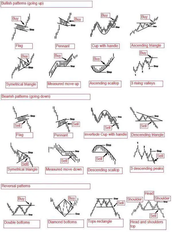
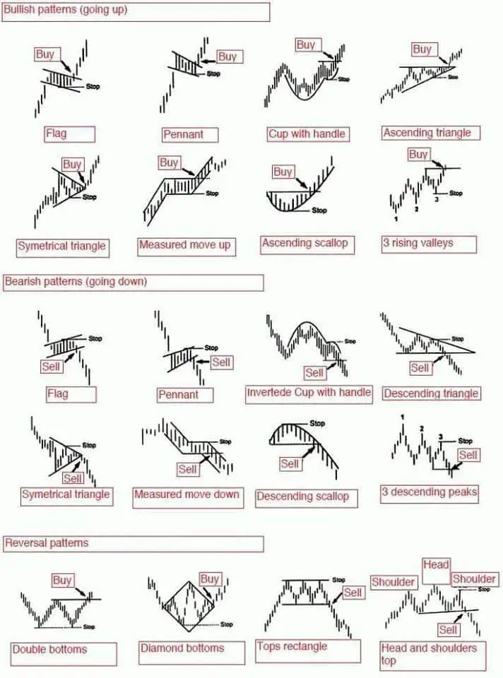
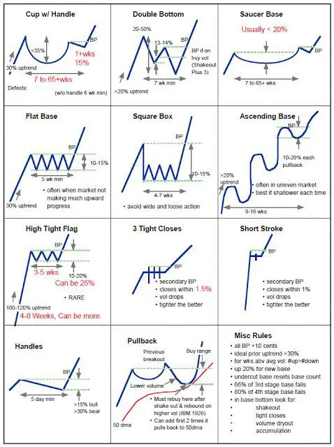
 Stock chart patterns are simply a visual representation of the prices buyers and sellers bought and sold at in the past. There is no magic in a chart pattern they just show you what happened in the past and what has a higher probability of happening in the future. The best use of chart patterns is to take a wider view of the trend on your time frame of choice and follow the path of least resistance.
A chart pattern can show that a stock is in a range with defined resistance and support. A chart could also show an uptrend of higher highs and higher lows or a downtrend of lower highs and lower lows. Stock chart patterns signal whether a stock is under accumulation or distribution or just trading in a defined price range.
The most popular use of stock chart patterns is for breakout trading signals as the probability increases of a move in a specific direction after a price breakout of a previous support or resistance. They are basically momentum indicators. The value comes in creating good risk/reward ratios by cutting a loss short when the trade doesn’t work out, but letting a winning trade run when it does.
Chart patterns can be bullish, bearish, or show a price reversal depending on the direction of the momentum. They can also be used as risk management tools showing where to set stop losses if a breakout fails or set profit targets for a continuation.
A chart pattern is a visual tool for seeing which direction a market is moving in. People that dismiss chart patterns and believe they don’t work show their own ignorance on the core of profitable trading which is to create good asymmetric bets, not to win everytime. Profitability comes from profits being more than losses over the long term not predictive ability or perfection.

For a full explanation behind the principles of these patterns check out The Ultimate Guide to Chart Patterns.
