This is a guest post by @TraderLion_
When you look at the greatest stocks in history, there is one common element regardless of their story or sector, and that is superior price action and relative strength.
And so one of the keys to achieving superior returns is learning how to identify stocks exhibiting relative strength before and during their impressive uptrends.
So what is relative strength?
Relative strength (RS) separates leading stocks from laggards. It signifies outperformance of the stock relative to all others in the market.
We can visualize relative strength using the RS line, which divides the stock’s daily closing price by the SPX. The trend of this RS line provides a visual representation of how the stock is performing versus the general market.
To understand the significance, you need to understand why a stock would be displaying RS in the first place and why it is a leading indicator of potential outperformance.
A quick sidenote, We are NOT talking about RSI. That is a completely different indicator and concept.
What moves the market?
Large institutions like mutual funds, hedge funds, banks, insurance companies, trusts, etc… make up 75% of the total volume in the market.
These institutions create the trends we see in the charts through their large sells and buys.
Therefore, it makes sense that if these institutions are moving the markets that we would ideally want to be in the same stocks as them, right?
And wouldn’t it be nice if we could see their top ideas? Well, we certainly can follow their footprints by learning how to identify relative strength.
Look over this quote by William O’Neil:
It is one of the great paradoxes of the stock market that what seems too high usually goes higher and what seems too low usually goes lower.
To the average market participant, they think that a stock trading at new highs can’t possibly go higher. They believe the higher it is, the harder it will fall, and so they buy the company making 52-week lows because “It can’t go any lower.”
This is the opposite mindset that you need to have. We just discussed how large institutions are the ones that are moving the market. So why would a stock be making new highs? Simple, because they are buying it. Institutions are investing with a 10-year time horizon and with top quality research departments they know that these stocks have a bright future.
They know if the company is or will be growing earnings and sales rapidly, and if their products will change the way we work, live, and play. And most importantly they know that a stock which may seem expensive now can actually be cheap because of its strong growth prospects.
In one sentence, the stocks showing relative strength and are trading at all-time highs are doing so because they are in high demand and are being accumulated by institutions.
Vice versa, a stock making fresh lows doesn’t have a buyer in sight and it’s not us who will be able to put in a new support! It is showing relative weakness.
So this way of thinking alone helps us identify the leaders of the market, the ones with the highest potential to double or triple in value because they are being accumulated by institutions.
Relative strength becomes useful when you use it to identify these stocks in the very early stages of their big move.
In addition to focusing on stocks near their all-time or 52-week highs, we can use the RS line, especially during market corrections, to identify potential leaders going forward.
If you want the relative strength (RS) line on your charts – we wrote an article that shows you step by step how to add it for free on multiple platforms here: Plotting the Relative Strength Line.
When you are done with that, let’s go over an example of finding relative strength using COUP from March 2020.

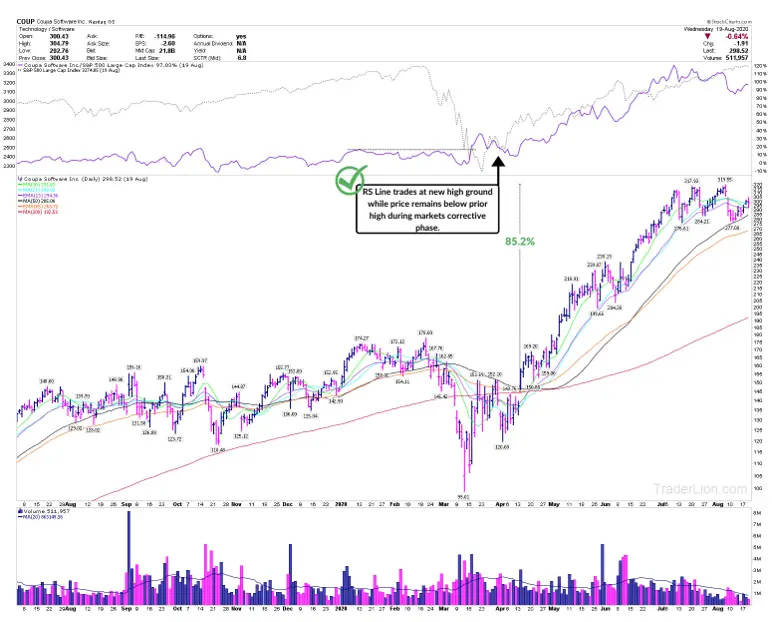
COUP displayed relative strength right before it exploded 90% over the next 4 months. Notice how the purple line at the top (RS line) made a new high while the market was in a correction?
This is a major characteristic shared by leaders coming out of a correction. We call it RSNHBP or Relative Strength New High Before Price.
This means yes, even though COUP has sold off from its highs – it was still outperforming because it was not going down as much as most other stocks.
Why didn’t it go down as much? When markets go down and enter “corrective periods,” financial institutions begin looking for names they’d like to own and build positions in anticipation of the new uptrend. As they build positions in these names, naturally it will slow the price descent relative to other stocks that are not being accumulated.
If large institutions are building a position, what do you think will happen when the uptrend resumes and the market rebounds?
The demand in COUP will be so great that the price has no choice but to rise – often explosively.
If you begin to pay attention and focus on relative strength, you will see this situation play out over and over again – tipping you to which stocks will potentially be the strongest in the market.

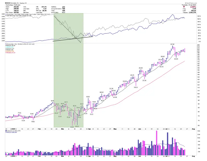
Above is another example of relative strength in DOCU. In the highlighted section, notice how the grey line that represents the general market is descending while the blue relative strength line is making new highs.
This is clear Relative Strength. Your job is to note this down and wait for a proper breakout when the uptrend resumes. DOCU went on to more than double in a little over 4 months.
The bottom line:
Start to become aware of relative strength in both individual stocks and overall groups. You will find your next big winner. When a stock is displaying relative strength versus the general market, this is a result of institutional accumulation. The stocks that share this characteristic are generally not only the first ones to move after a correction but go on to generate the biggest returns. Additionally, spotting relative strength among an industry as a whole relative to the general market will help you identify where money is rotating to next.