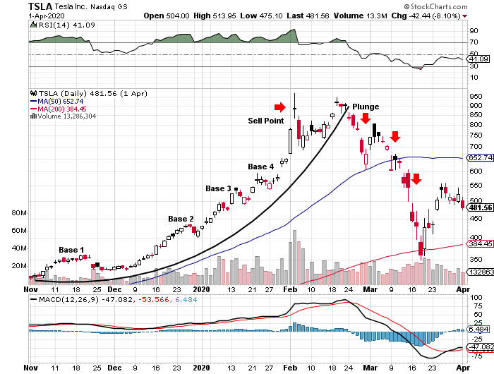
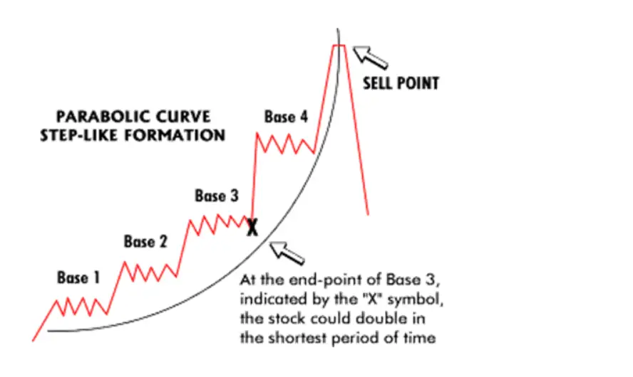
Chart courtesy of ChartPattern.com
The parabolic curve chart pattern is one of the strongest uptrend patterns a stock can have. This type of pattern goes up the farthest and the fastest as it is under the strongest accumulation and every small pullback is bought by eager traders and investors.
The parabolic curve is named after the parabola, because the ascending curving trend line used to identify the strength of this pattern from the price support action looks like a parabola. This strong price pattern can give a trend trader incredibly high returns in a very short time period.
Many times you will see stocks going up like this near the beginning or end of a bull market advance. This pattern creates short term price range bases before breaking out to new highs and repeating this range pattern multiple times as it keeps going higher.
The price action pattern that creates the parabolic curve looks like a staircase. This pattern can last for weeks and sometimes months. The danger comes in near the end of the formation after the biggest move straight up into extremely overbought territory the strong upward price action usually ends suddenly in a price plunge that falls even faster than it rose.
These patterns generally happen to growth stocks that have new products, new technology, new business models, or new leadership. Stocks that perform this strongly are usually market leaders. The key in trading a trend this strong is capturing as much of the move to the upside as possible with trailing stops and having a plan to exit and lock in those gains and not riding it all the way back down.
Parabolic Curve Chart Pattern Example:

