This is a Guest Post by @BullDudeC of BullDude.com.
A Japanese candlestick chart is a type of visual price display of a financial instrument.
Usually charts are displayed as a line that combines the closing prices of the various trading sessions. The disadvantage of this type of display is that only the closing price of the session is displayed without giving any indication of the behavior of the price during the trading session.
This problem is solved by the Japanese candlestick chart, where for each trading session it is possible to identify the entire price behavior throughout the trading session. In particular, the low price, high price, closing price and opening price are shown.
In this short and simple tutorial you will learn how to build a Japanese candle chart using Microsoft Excel.
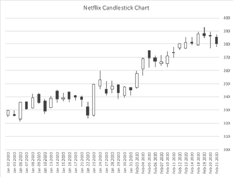
In this tutorial I used Microsoft Excel for Mac and I have created the Netflix (NFLX) candlestick chart using the prices from January 1 2020 to February 21 2020
TUTORIAL – 4 STEPS
1) Filter the dates from January 1, 2020 to February 21, 2020 then download the opening, closing, low and high prices directly from Yahoo Finance site from the following link or just copy and paste them into an Excel spreadsheet: https://finance.yahoo.com/quote/NFLX/history?p=NFLX
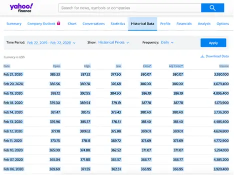
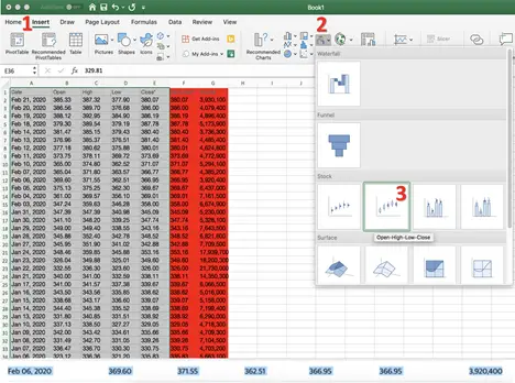
2) Select only the columns relating to the “Date”, “Open”, “High”, “Low”, “Close*”, ignoring the last 2 (highlighted in red) and follow this simple procedure for creating the candlestick chart:
- Select “Insert” (point 1)
- Select the type of chart “Stock” (point 2) and from the 4 available chart types select the “Open-High-Low-Close” chart (point 3)
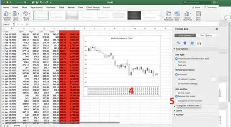
3) The chart that appears to you should be the same as this image below. As you can see, the graph is backwards due to the fact that our data range is from the most recent to the oldest. So we have to do these simple steps to get the final chart:
- Double click on the bar where there are the dates of the single days (point 4)
- A window will open on the right and you will have to click the “Categories in reverse order” (point 5)
If the price scale does not adjust automatically as in my image (300 as a minimum value) but starts from 0, read at the bottom of this article the “Extra” section where I explain how to adjust the scale.
4) At this point you should have the correct chart. The default candles are white (bullish) and black (bearish).
If you want to know how to set up green bullish candles and red bearish candles go to the extra section below.
EXTRA:
How to set the color (red and green) of the candles
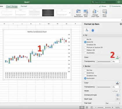
In case you want to change the color of the candles follow this simple procedure:
Double click on a bullish candle (white) (point 1) and from the window that opens on your right click on “Color” (point 2) and choose the green (or one you prefer). Repeat the same procedure for bearish (black) candles and select the red color.
How to adjust the price scale to the chart
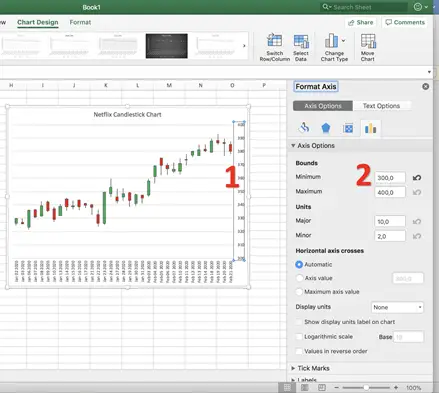
In the event that the price scale starts from 0, making the chart difficult to read, follow the following simple procedure:
Double click on the price scale (point 1) and from the window that opens on the right “Format Axis”, make sure you are in “Axis Options” and in the “Minimum” box (point 2) enter the value of 300.
Continue to follow NewTraderU.com because soon you will find a mini-guide on how to create moving averages (and the related cross) on Excel.
You can also see current chart analysis from @BullDudeC at BullDude.com.
