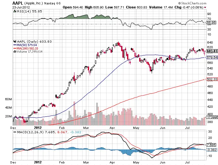
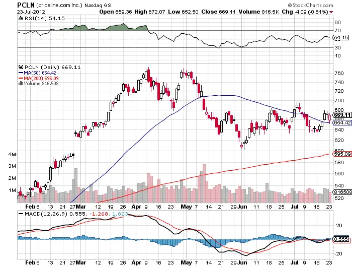
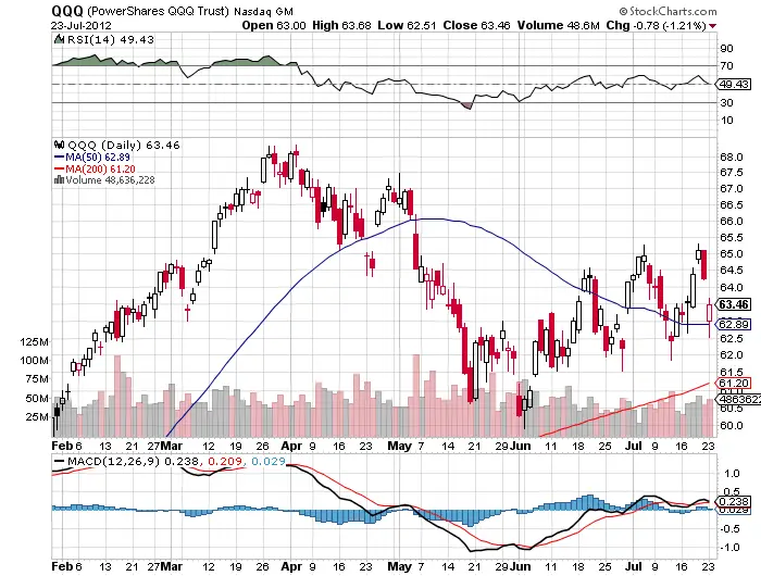
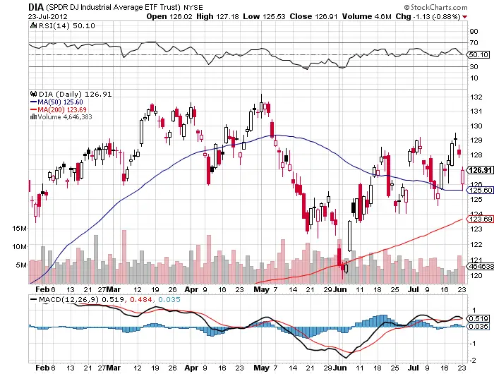
If you still wonder what the dividing line is between an up trending market and a down trending market is here are some charts to look at. In the Apple chart you will see the powerful trend that exploded after Apple over took the 50 day line this year. Also you will notice the first bounces at the 50 day during the first correction in the trend this year for both Apple and Price line. Pay special attention to today’s action in the index tracking ETFs and Price line and how the 50 day line was bought and supported even with the fears of Spanish yields soaring over 7% and a Greek EU exit shaking the markets today. The chart is growing more volatile and the 50 day is becoming more of a downward magnet than a support for prices. We will be able to benefit from a down trend by first waiting for a close below the 50 day moving average and then playing the short side and trailing it with the 5 day ema. Currently the Apple earnings are on tap to battle the European debt crises. If this market does roll over the 50 day should begin to act as resistance after it is broken and the next support level will be the 200 day simple moving average in a down trend. Stocks travel much faster down than they do up and big profits can be made at the beginning of a true downtrend. Moving averages are not opinions like trend lines, they are 100% quantifiable facts that can lay across your chart like a border, and once it is crossed could mean a stock is entering new territory. The more times this level is challenged the more chances are that it could break.


